Hey hey! How are you? Any fun plans for the weekend? I was supposed to be on my way to the SNAP Conference to speak on Saturday, but the Bub’s first big baseball event is this weekend and I just could not miss it. So we’ll be doing lots of baseball and I’m hoping to sneak in a little DIY project.
It’s in the kitchen, so it’s fitting that I’m highlighting some of the ahhhhmazing kitchens you all linked up at last month’s Show Us Your House party. Wowsers – this was probably my favorite party yet!
I’m been drooling over Megan’s beautiful kitchen since the first time I saw it:
I love that so many details were thought out, in addition to it just being plain pretty. :) I really love that dark wood island with the marble top too. Told you…drool.
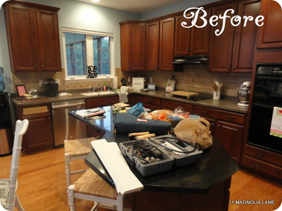
The links were FULL of before and afters, and Christy’s is one of my favorites – here’s the before:
And the after – she even painted the tile!:
That is a fearless woman and I love her for that.
There were a BUNCH of white kitchens, and I gotta say I’m on that train now. They are timeless and I love looking at them…gorgeous.
I love that Holly’s space shows that a white kitchen doesn’t mean a stark kitchen:
The fun color is a perfect backdrop to the bright cabinets. How FUN.
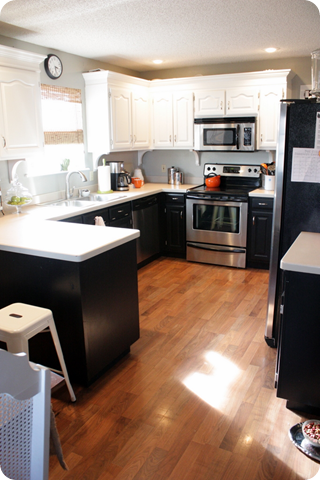
Michelle’s redo was pretty spectacular too – and they went two-toned:
I love the black on the bases and white above!
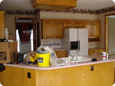
Not everybody goes white of course (nor should they!). Jenny’s makeover is FANTASTIC – from the before:
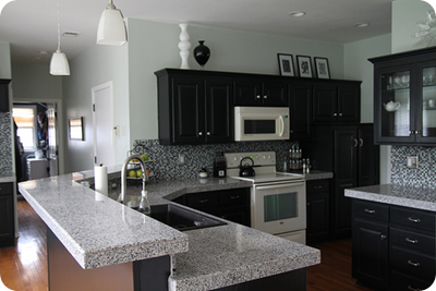
To a totally sleek and modern after:
Those are the same cabinets -- yet another example of the power of paint! (I love that they added another tier to the peninsula for more seating.)
I think I’ve highlighted Julie’s kitchen before, but I am again because I love it so:
There was an awful lot of wood going on before, so they painted the cabinets black, and added some major character by adding the ceiling beams as well. And I DIE over those windows over the sink.
Most of these kitchens took a lot of paint to get to where they are now. But I loved some of the quicker, less expensive updates you made too.
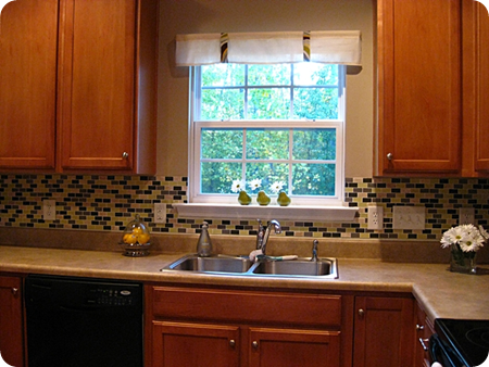
I love love love the colors in Amy’s tile backsplash:
I think they’re a stone, light green, grey and blue? Actually I think it’s black, not blue. But anyway, I think it’s totally fun and added the pop they were looking for in their kitchen! (And I want those little pear vases!)
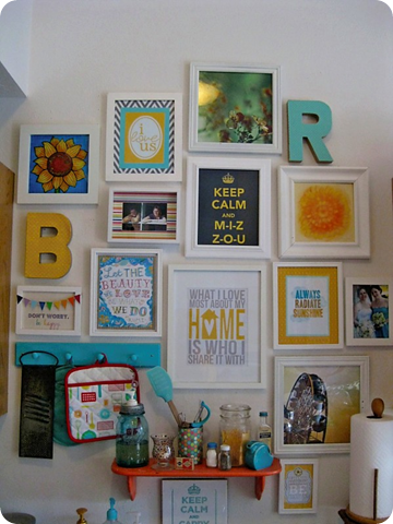
Brittany did something I don’t think I’ve seen before – she took what was an awkward spot above her kitchen sink and turned it into her “Happy Wall”:
Oh. my. goodness. I love this. Love the colors, love the art, the photos, everything. What a sweet idea!!
Well that was fun. :) I hope you were inspired by these kitchens and the 230 linked up over at last month’s party! I so wish I could highlight every single one – they were all awesome.
Now I’m inspired to work on my little project this weekend. Crossing fingers it works. You never know…
Have a GREAT one!





0 comments:
Post a Comment